Imagine Crafts Packaging
Rebrand of a crafting tools line to bring a consistent look and feel

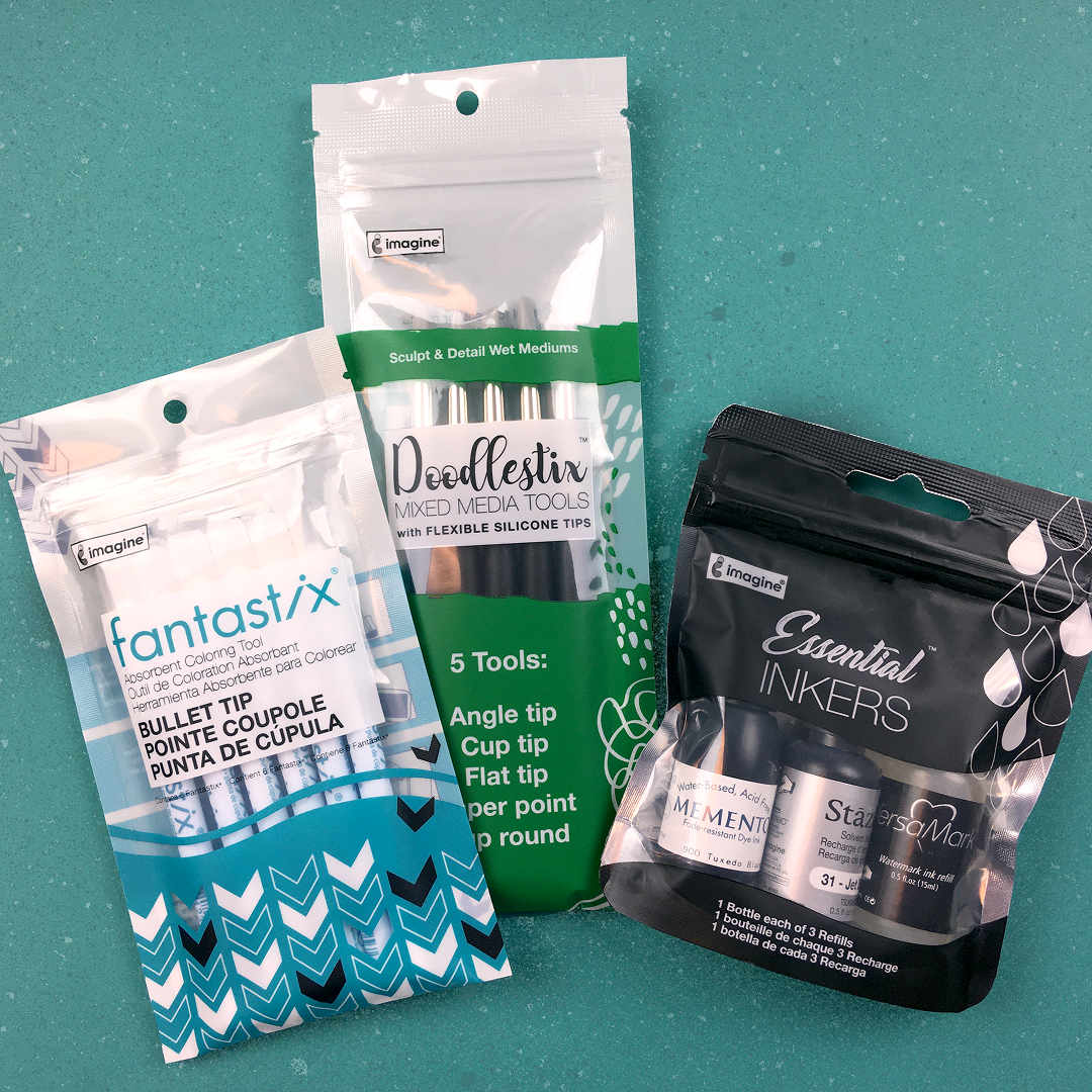
DoodleStix
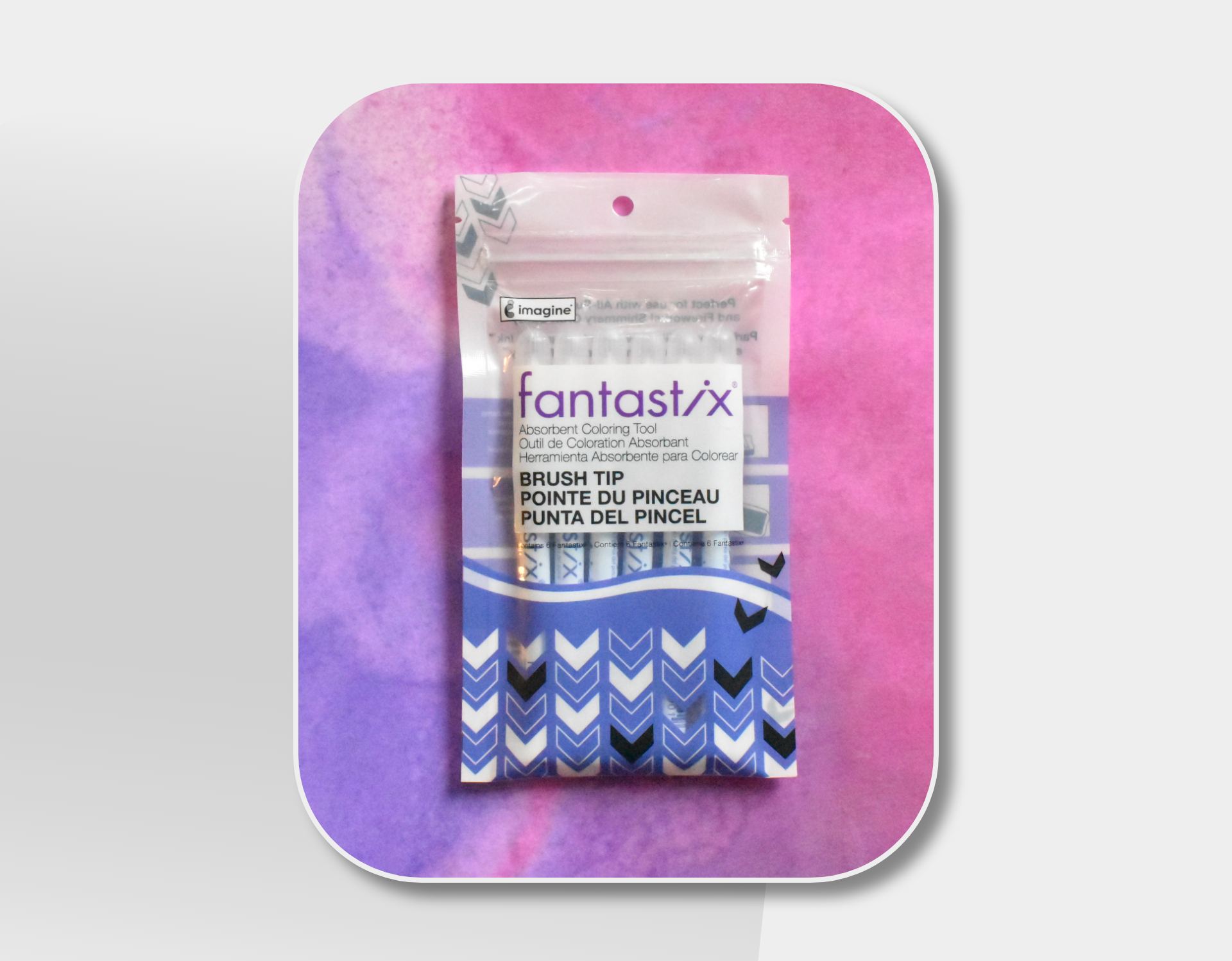
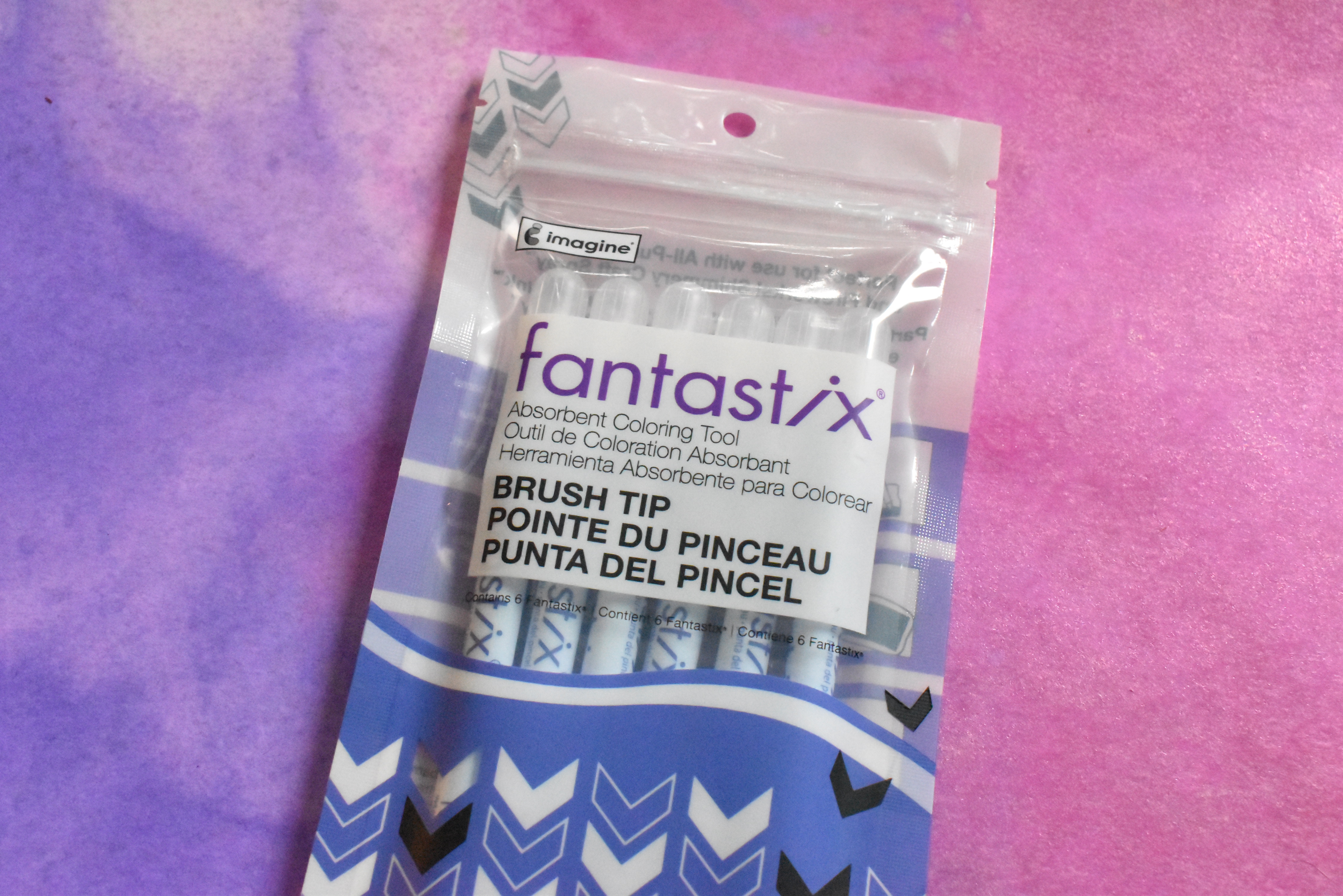
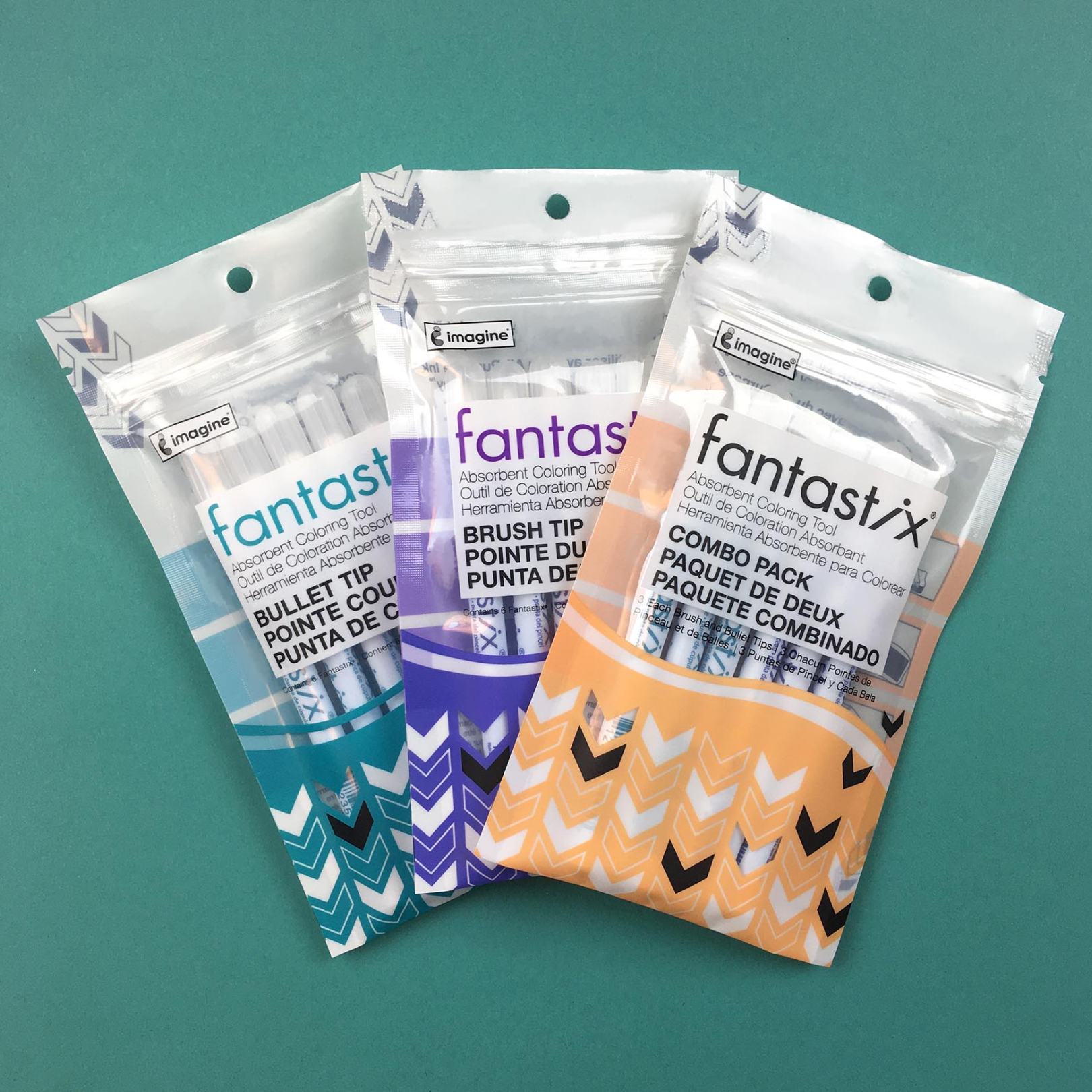
Fantastix Packaging
Project Details
Overview
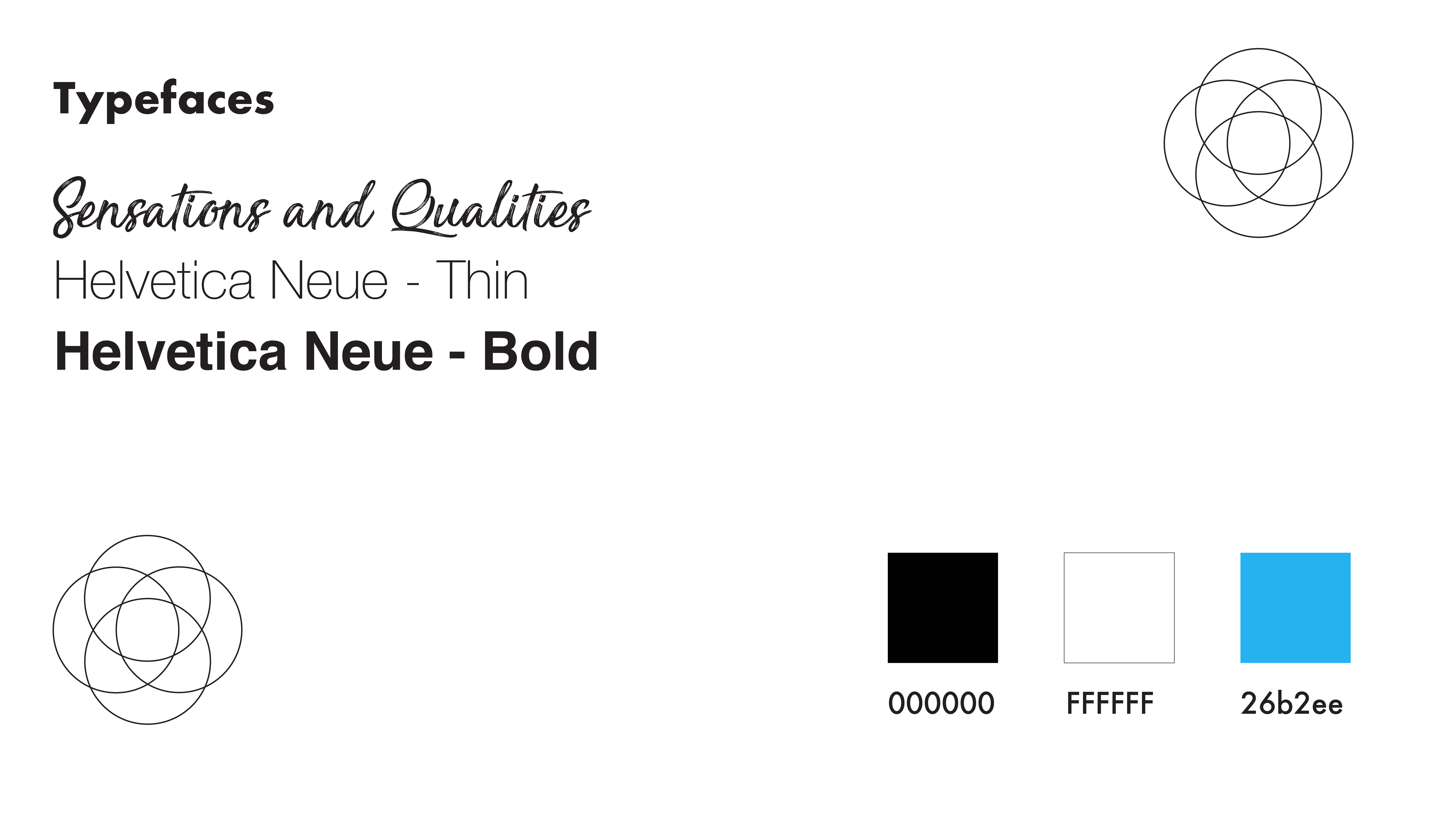
To keep Imagine Crafts competitive in a rapidly shifting craft and hobby market, I led the strategic redesign of the full packaging system for the company’s tools and ink line. What began as a cosmetic refresh evolved into a foundational brand transformation built around a new identity I created called GEO-FEM—a blend of clean geometric structure and soft feminine curves that better reflected both the product line and our predominantly female customer base.
My Role
I owned the full rebrand from concept through pitch and implementation. Working directly with the business owner and marketing manager, I developed a clear creative strategy centered on three core elements:
- A repeatable geometric motif that tied the product family together and improved shelf recognition
- A signature curved form that introduced warmth and approachability, aligning with customer taste and category trends
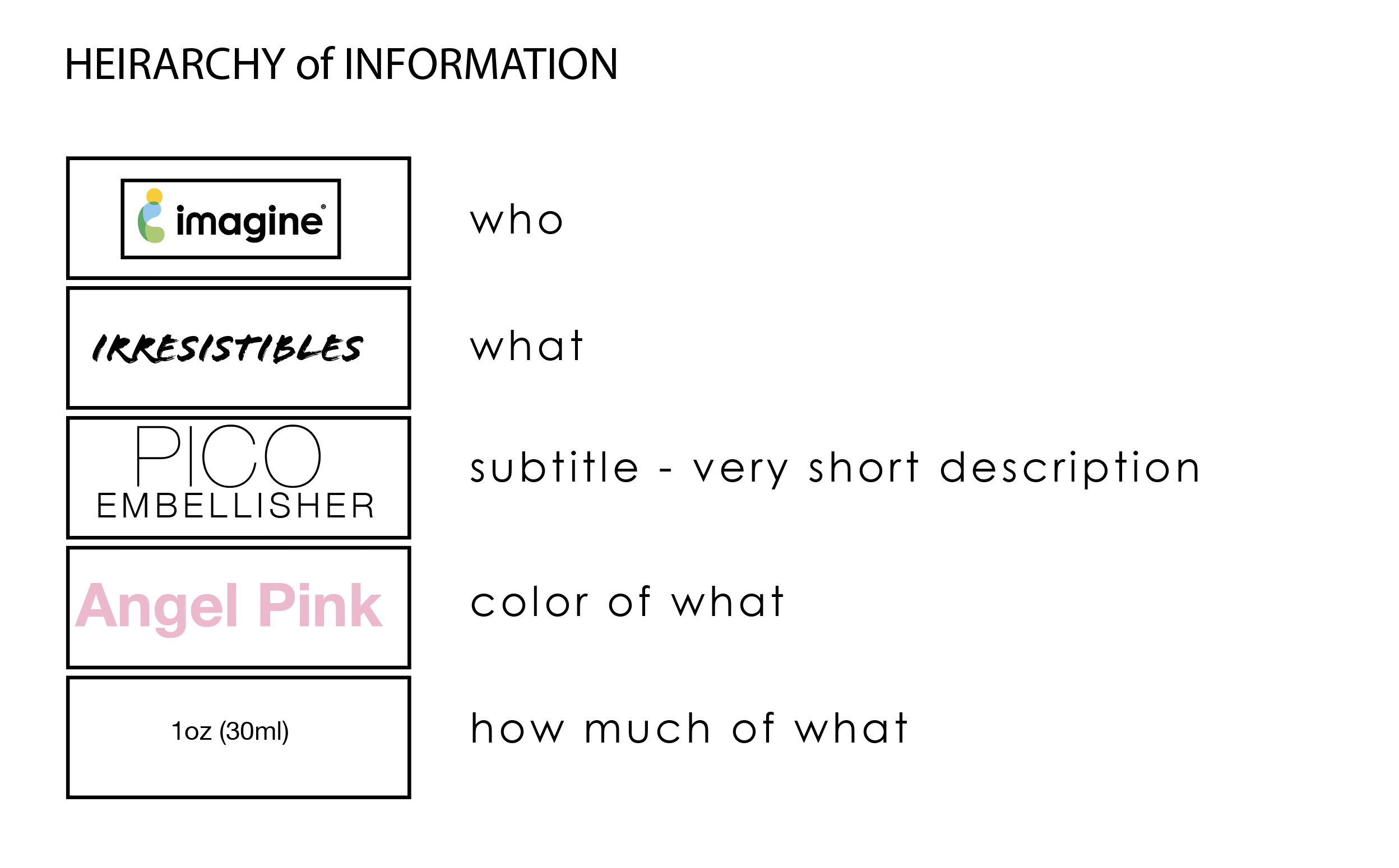
- A structured information hierarchy that simplified product education and improved shopability across retail environments
This identity became the visual and strategic backbone for every SKU in the relaunch.
Impact
The GEO-FEM system elevated the brand’s presence online and in-store, offering retailers a cohesive line that stood out against competitors. The modernization and clarity of the new packaging directly contributed to the addition of 6–8 new SKUs picked up by major retailers, resulting in $200K in increased sales within the first year.