There’s a classic trick in photography where the subject is razor sharp focus and the background is beautifully blurred. The goal is simple: tell your audience's eyes where to go. In busy scenes—thick forests, city streets, or a dramatic mountain range—your gaze wanders around for a bit, taking it all in, before eventually landing where the photographer intended. The happy couple. The athlete mid-stride. The person doing the thing.

White space has the same effect in graphic design.
Instead of screaming information at you in a chaotic way, white space quietly pulls you in. It creates focus. It gives your eye somewhere to rest before analyzing the whole scene. Spacious compositions tend to feel editorial, confident, and intentional while clutter robs your senses of these feels.
Why do I bring this up? As a designer there is a difficult irony in working for major companies and earning a living. Companies seem to have caught the Amazon mind virus for design. If a retailer has an online presence then obviously we have to mirror Amazon because look at how successful they are. That must be good design. Eh. I could not disagree more with that logic. Amazon is not just a website visually. Amazon is a search tool. Amazon is a frenzy of customer obsession and Choke Point Capitalism. If you ever what a great read on the subject: Chokepoint Capitalism - How Big Tech and Big Content Captured Creative Labor Markets and How We'll Win Them Back By Cory Doctorow and Rebecca Giblin.
The visual layout of Amazon's site is the opposite of the white space directing the eye. Amazon has a tight yet cluttered design system which bombardes the senses with a visual messages of "we have it all". Do you need a microwave, a pair of socks, and a lawnmower? Well, get it here. That is their brand. From A-Z, it is their core principle in their design system. Information organized no doubt but definitely too much to take in.
So strangely enough, I think the cluttered visual system for Amazon 100% works for them. They do not have a specialty, they do no have stores (not really I think they tried once), they are not small, and I think that is ok. What about a normal type of business wanting to tell a story and have that story appeal to a new customer? It leaves other businesses with specific decisions to make. Define who you are and please do not bully your designers to match Amazon especially if the business model is focus on a niche such as medical, pets, finance, fashion, furniture, athletic gear or food. This brings me back to white space.
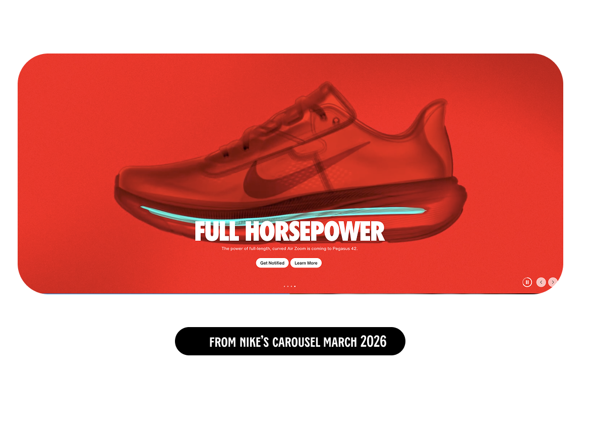
Nike is one of those brands (squish design crush) that absolutely gets their brand and leans in to white space and story telling to guide the eye. If you’ve ever landed on their site or opened one of their emails, you’ve probably noticed how much space they leave around their subjects. They sell athletic gear, but they’re not out there placing 2 styles of basketballs next to basketball outfits just to make sure you understand the assignment. Instead, they let the rockstar athlete do the talking. The hero gets to be the hero.
Only later—after you’ve clicked, after you’re emotionally invested—do you hit the plain product page. That’s where the shirt floats on white and politely asks you to add it to your bag. Nice.
This approach isn’t random. It’s strategic.
High-end storytelling photography isn’t cheap, and most retailers can’t afford to do a high level photo shoot for every single SKU they sell. Brands like Nike can be selective. They don’t try to sell everything at once the way Walmart, Target, or Amazon have to. They’re not stacking the homepage like a clearance bin. They’re building desire.
This is where things get tricky for digital designers. You’re often asked to tell a story in environments that don’t fully support storytelling—limited imagery, tight layouts, zero appetite for space. You’re expected to create magic without a hero image, which is a bit like being asked to make a movie poster with no movie.
But here’s the thing: whether a design is spacious or dense, minimal or maximal, the goal never changes. Connection to your audience is the goal. That connection happens when you have a clear concept of your brand and products and allow designers to use their visual storytelling instincts to form the visual narrative.